Turning clinical expertise into a website people actually trust
Nutriahaar is a nutrition and dietetics practice led by a senior clinical dietitian with real hospital experience. The clinical skill was never in question. The website was. Visitors couldn't tell what plan to pick, corporate clients couldn't find what they needed, and bookings dropped off before they were confirmed.
View LivePlans were unclear and corporate was almost invisible.
Two paths from the entry point, one clear Book action.
12+ bookings and 4+ corporate inquiries in month one.
Nobody doubted the dietitian. They could not work out the site.
Three symptoms, one cause: two audiences sharing one unclear page.
Individualwants a plan they can followCompanywants a team programmeBased on conversations with people who had considered booking. Illustrated, not a persona study.
From one shared page to two clear paths
The structure now mirrors the two questions people arrive with.
BeforeOne shared page: services, individual and corporate blended, clinical terms, unclear booking. Simplified from my notes. The old site is no longer live.
Everyone
Shared pages and the two doors
- Home
- Hero + one Book action
- Two doors: Individual / Corporate
- Services
- Corporate call-out
- How it works (5 steps)
- Testimonials
- About
- Recipes
- Contact Us
- Booking form
- WhatsApp Quick Connect
Individual
Someone who wants a personal plan
- Services
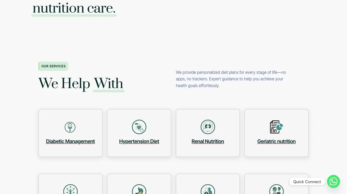
- 13 conditions and goals
- Diabetic Management
- Hypertension Diet
- PCOS/PCOD and women’s health
- Weight Management
- Child Nutrition
- + 8 more
- Book an Appointment
- Contact form
- Consultation
- Share goals
- 1-1 session
- Custom plan
- Ongoing support
Corporate
A company that wants a team programme
- Corporate Nutrition
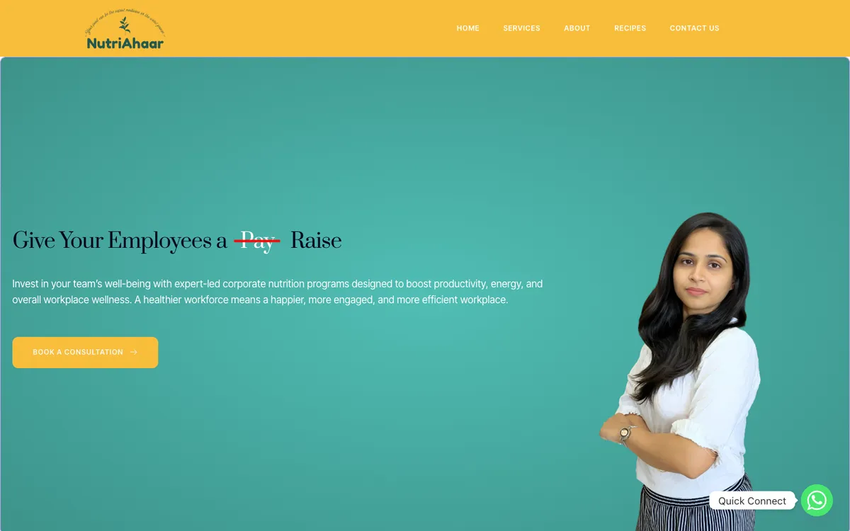
- Hero + Book a Consultation
- Why it matters (4 outcomes)
- What is included (6)
- How we work (4 steps)
- Book a Consultation
- Corporate engagement team
- Plan
- Define goals
- Curate a plan
- Final sign-off
Built from the live site. Each column is one audience, each box is a page, and each line under it is a section or step.
Two journeys, each with one clear way forward
Each path asks one question at a time and always shows what happens next.
Individual: from a need to a plan
Someone looking for personal nutrition care- ArriveLand on the homepageClear promiseOne headline and one main action
- ChoosePick the Individual doorLess to filterCorporate content is no longer in the way
- RecogniseSee their condition or goal namedPlain namesServices listed by what a person is dealing with
- ActBook an AppointmentOne actionA single clear button, not a long multi-step form
- MeetShare goals, 1-1 consultationNo surprisesThe five steps are shown before anyone commits
- ContinueCustom plan and ongoing support
Corporate: from a team goal to a signed plan
An HR or admin contact looking for a team programme- ArriveLand on the homepageVisible, not hiddenA call-out asks: need a team programme?
- ChoosePick Corporate NutritionIts own homeA dedicated page, not a paragraph on a shared one
- UnderstandWhy it matters, what is includedAnswers firstOutcomes and the six inclusions, before any form
- ActBook a ConsultationOne actionSame single-button pattern as the individual path
- PlanDefine goals, curate a planClear next stepsFour steps shown, so a buyer knows what happens
- AgreeFinal sign-off
Steps are taken from the live site’s own “how it works” sections. The notes under each step explain what I changed.
Three decisions that did the work
Each decision removed a specific reason for dropping off.
Split the entry point, do not just relabel it
Two audiences kept filtering past each other’s content. Should I fix the labels, or the structure?
Plain language over clinical terms
Nutrition vocabulary made sense to the dietitian, not to a first-time visitor deciding whether to book.
Make booking feel low-risk
People second-guessed a form that showed many steps before they had committed to anything.
What the solution looks like
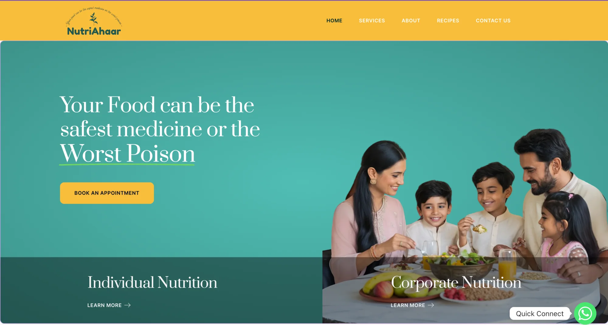
The structure shows up on the very first screen.
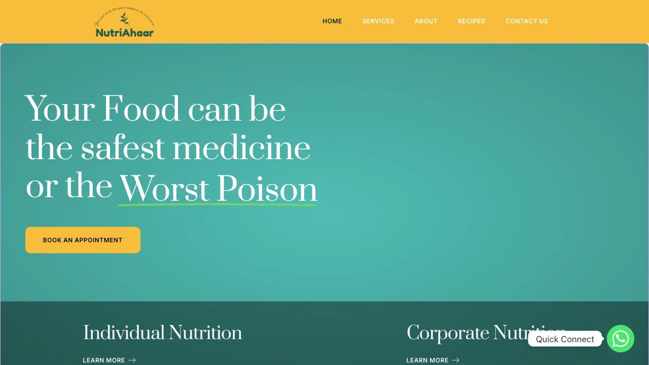 12345


The same practice, a path people could follow
Fewer places to get lost, and one obvious way forward on each path.
The visitor’s path, before
- Lands on one page for everyone
- Skims past content meant for someone else
- Hits terms nobody explained
- Cannot tell what to pick, or whether a team programme exists
- Meets a booking form with unclear steps
- Leaves before confirming
The visitor’s path, after
- Lands on a clear promise and one main action
- Picks the Individual or Corporate door
- Recognises their situation in plain words
- Sees the steps that follow
- Presses one Book action
- Books, or sends a corporate inquiry
first month after launch
from a page that went almost unnoticed
Splitting the entry point. Every other improvement only worked because each visitor first landed on the path meant for them.
What I can and cannot claim. The dietitian's clinical expertise did not change between the old site and the new one, so these numbers come from what visitors could find and trust, not from a change in the service. They are client-reported figures for the first month, not an audited long-term baseline.
What I would do next
The first month proved the structure. Measurement comes next.
Track which step people leave on, on both paths. I only have first-month totals from the client.
See which inclusions make a buyer press Book a Consultation, and which are noise.
Place a short testimonial next to each Book action, where people decide.
Component patterns, live on nutriahaar.com
A warm teal and yellow palette that feels approachable, not sterile. Hover to try the patterns.